

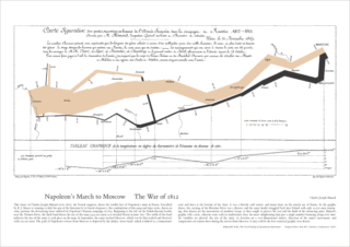
Anyone can make a chart. There’s enough how-to’s on the internet to twist data in hundreds of useless shapes that will depict data however you see fit. Here is an example of a beautifully made chart from Charles Joseph Minard depicting Napolean’s winter march to Moscow and the number of troops over the campaign:
“If only one man dies of hunger, that is a tragedy. If millions die, that’s only statistics.” Joseph Stalin (1947)

 Without the change from a stein to a cup, the difference in caffeine represented would be difficult to distinguish. Seriously, how often can you tell the difference in squiggly lines? It’s not a common comparison. The same goes for charts and graphs. Two seemingly recognizable objects formatted for comparison will tend to have issues with scale-ability. This is not only a concept that distorts data, but is commonly used as a convincing point. Think of it like Stalin’s quote. Imagine a chart that only has two numbers 1 and 1,000,000 with a scale of 1,000,000. The 1 looks like a thin line by comparison. Now add another number, let’s say 10. The 10 and the 1 look nearly identical. Change that 10 to 100 and I doubt a random person would be able to tell the difference, especially if the chart is not labeled. Those differences can influence decision makers and, more importantly, influence the average person. The ethical results vary wildly with the editing of the chart.
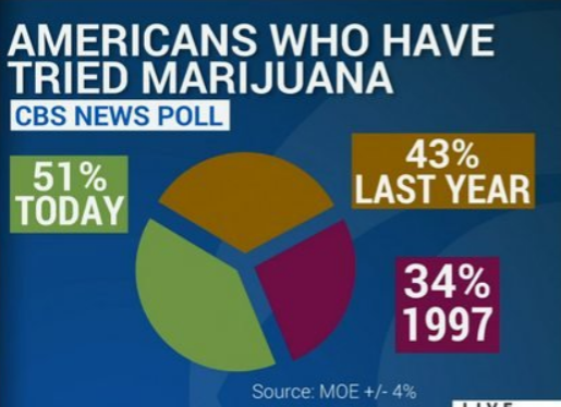
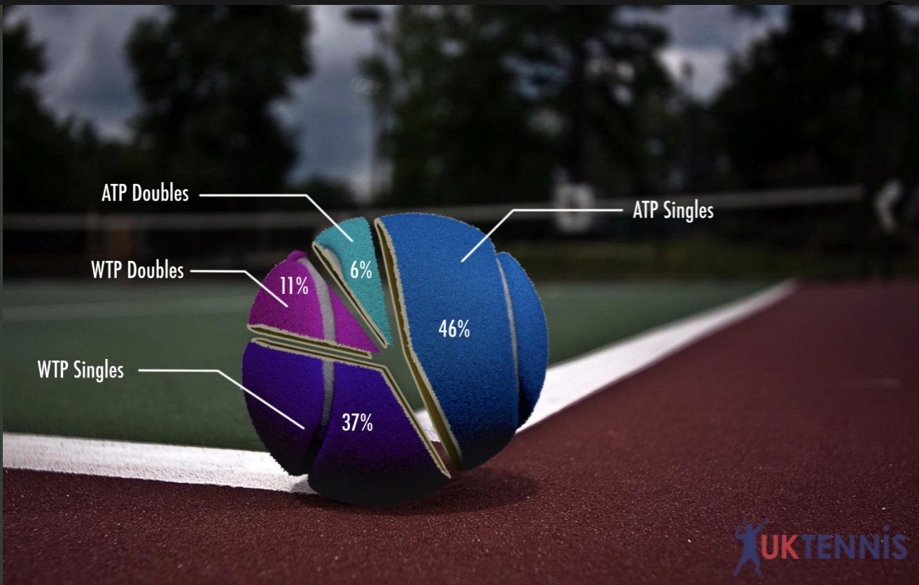
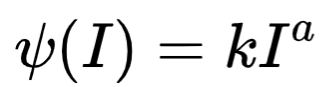
Before I get into too much of a rant with ethics, just consider the amount of knowledge it takes to properly make something as seemingly simple as a chart or graph. Question the the heck out of one when you see it. Steven’s law comes into place more than you think. Some examples include: bubble charts, 3d rendering of a pie chart or column graph, and line graphs that fail to express correct X-Y scaling. The list really goes on and on. The purpose of these images is to make information more accessible, not deceive. So, if you see an image that has taken data from literally anywhere and recreated it with some form of chart/graph, scrutinize it. Don’t take it for face value. If you find that you are the one creating the chart/graph, try your best to follow as many best practices as possible.
Without the change from a stein to a cup, the difference in caffeine represented would be difficult to distinguish. Seriously, how often can you tell the difference in squiggly lines? It’s not a common comparison. The same goes for charts and graphs. Two seemingly recognizable objects formatted for comparison will tend to have issues with scale-ability. This is not only a concept that distorts data, but is commonly used as a convincing point. Think of it like Stalin’s quote. Imagine a chart that only has two numbers 1 and 1,000,000 with a scale of 1,000,000. The 1 looks like a thin line by comparison. Now add another number, let’s say 10. The 10 and the 1 look nearly identical. Change that 10 to 100 and I doubt a random person would be able to tell the difference, especially if the chart is not labeled. Those differences can influence decision makers and, more importantly, influence the average person. The ethical results vary wildly with the editing of the chart.
Before I get into too much of a rant with ethics, just consider the amount of knowledge it takes to properly make something as seemingly simple as a chart or graph. Question the the heck out of one when you see it. Steven’s law comes into place more than you think. Some examples include: bubble charts, 3d rendering of a pie chart or column graph, and line graphs that fail to express correct X-Y scaling. The list really goes on and on. The purpose of these images is to make information more accessible, not deceive. So, if you see an image that has taken data from literally anywhere and recreated it with some form of chart/graph, scrutinize it. Don’t take it for face value. If you find that you are the one creating the chart/graph, try your best to follow as many best practices as possible.