Welcome to Part II of how we at Pro Bono Net designed and tested the new LawHelp Refresh design. Check out AlaskaLawHelp.org, MontanaLawHelp.org, and AlabamaLegalHelp.org (among many others) to see it in action. Back in Part I, I discussed how we handled the design process itself and the kinds of lessons we learned. In Part II, we will now look at how we structured usability testing including how we recruited participants.

A special thanks to Lagniappe Law Lab who maintains the content on LouisianaLawHelp.org, our pilot partner for this project. We not only launched with them first but Lagniappe Law Lab was a huge help in recruiting participants so that we could test that site with local users.
Part II
Usability test structure
Once the design process was over and a pilot site design had been completed, we began usability testing. Usability testing simply tests how intuitive a design is. Can users easily navigate the site? Are they using our intended workflows? Where do they get stuck or lost? And what surprises are there? If you are curious to learn more about why we usability test, check out the Connecting Justice Communities blog where I wrote last summer about our usability testing process, why you should embrace being proven wrong, and how to quickly reiterate post-testing.
Our usability test structure can be boiled down to a few key components:
- Real-life scenarios
- Organic interaction
- Avoiding leading the user
- Standardized scripts & recordings
- Recruitment
Real-life scenarios
Usability testing is exactly what it sounds like, it’s testing how usable a site is. This is done with real users, using real life scenarios as a backdrop for finding critical resources on LawHelp.org sites. When the user cannot complete the task we gave them or is confused by something, that means the design has failed the test (not the user).
To test this new design, we developed a beta version of LouisianaLawHelp.org in the new design where all the components of the site were functional. Using a possible eviction as the scenario, we explained to each participant that they should pretend that they live in an apartment, their landlord is considering selling the building, and that they are worried about being evicted. We then walked them through a process of finding information on eviction, landlord negligence on repairs relating to a recent hurricane, and more.
Here is the exact prompt we used:
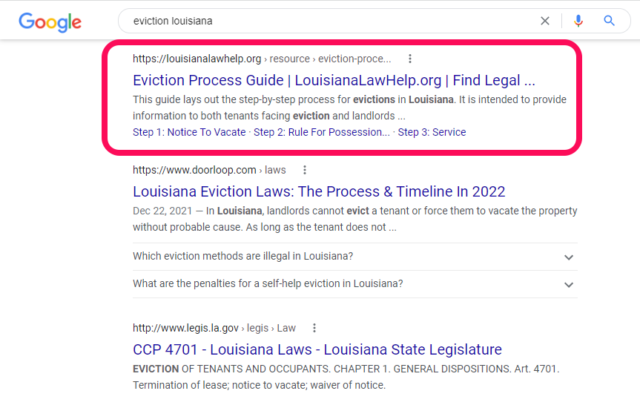
“Let’s say you rent an apartment and found out your landlord is considering selling the building. You did a web search for ‘Louisiana eviction’ and clicked on a link that sent you here.”
When planning this scenario, we considered a few things:
- Is this scenario clear, common, and relatable?
- Will this scenario be nuanced enough that the user will need to visit several areas of the site?
- Will the user be able to hold this in their mind the entire time, simulating a realistic search session?
Organic Interaction
When picking a scenario for usability testing, you want to ensure that you can hold off on leading the user as much as possible. Organic interaction is the most ideal testing ground to see how your design will hold up in the wild. This is tricky because you do need to test a number of components and thus, without leading them too much, you need to structure it so that they will likely interact with the components you are testing.
Here’s an example of how we struck that balance. Most LawHelp users arrive at a LawHelp page having done a web search for a legal issue such as “eviction Louisiana” or “divorce NYC.” They then click a link to a LawHelp site directly into a resource page. This means they visit LawHelp first by going about 3 pages deep immediately, bypassing the homepage.
So where did we start our testers? On a resource page! We gave them a link and then simply said “take a look through this page and tell me what you see.” This kept things open but gave us a ton of information. We observed what they found in the content, how they navigated that content, how they interacted with the navigation bar and footer areas, etc. By keeping the prompt so open-ended, we also found out what things grab the user’s attention as well as what they completely ignore.
Tip: Be prepared to see some of your most beloved design choices be totally ignored. This is good because again, it’s best to be proven wrong early rather than later!
Avoiding leading the user
We then wanted to see, could the user find other resources on a related topic (a common existing LawHelp user path). We asked them,
“Now after reading this, let’s say your landlord has failed to make some necessary repairs. Where would you go now to find help on this?”
This was an organic question within the scenario but this pushed the user to find primary navigation tools, navigate information hierarchy, interpret labels and calls to action, etc.
Don’t ask questions like, “find the navigation bar” or “can you find the filter for other topics?” These are extremely specific and don’t capture the way an average person would approach the site. As a user, you are thinking about your eviction issue, not site components.
The only exception is if you feel a major component, such as the search bar, is not being noticed at all even after several scenarios that would likely lead to organic interaction with it. At that point, you could break and ask “do you see a place to search by keywords?” This is a helpful last result. I have had to do this on previous projects and it proved that certain components were totally undiscoverable.
I want to underline that this is a last resort. It is essentially a post-mortem question. During analysis, you’ll have to acknowledge that they did not find it until you pointed it out. It’s helpful to ask but can only be used to prove that they couldn’t find it on their own.
Standardized scripts
A key aspect of reliable results is conducting the tests in a standardized way. Use the same script, say the same words, and record the session. The more you deviate from the initial structure, the more likely it is you will get different results which muddies the waters when it comes time for analysis.
Usability testing is (most of the time) not “pure” research. Pure research is rigorous, highly scientific, and undergoes peer review (as Erika Hall explains in Just Enough Research which I highly recommend). Most tech teams won’t have the luxury of such a slow and rigorous process. However, the more control you can keep over the consistency of testing experience between participants the better.
Recordings
Record your sessions! This is crucial. You will not remember everything and taking verbatim notes during the session is both difficult and pulls you out of what’s happening. Plus, recordings allow colleagues to review the session too and provide alternate interpretations and perspectives. At the end of testing, you will definitely need to refer back to a recording. Keep them clearly labeled and organized in your drive for easy reference.
A note on ethics: Your participants should know well before the session begins that you are recording the session. They should also know exactly what you will do with the recordings, whether they will be published/quoted in any way, who will have access to them, etc. We inform our participants that we will never publish recordings without their permission and that if we quote them in publications, we will do so in an anonymous manner. Recording requires strong ethics so get your policy straight before even inviting people to sign up.
Recruitment
We recruited carefully, attempting to reach a diverse set of users that would give us the varied perspectives and experiences we needed. We did this both alongside Lagniappe Law Lab, our pilot partner, and via our larger LawHelp network channels. We attempted to find a diverse grouping around:
- Income
- Race/ethnicity
- Age
- Gender
- Occupation and familiarity with the legal system
The latter point was to try and get users who are both self helpers and professional helpers. The self helpers are users who come to LawHelp looking for help for themselves or a loved one. Professional helpers tend to be paralegals, social workers, or even attorneys who are trying to refer clients to helpful resources and services.
Tip: When creating a sign-up form, don’t forget to ask basic questions like “Do you have a reliable internet connection? What devices do you have access to? Do your devices have a working webcam?” These may seem obvious to you but they aren’t to everyone.
We utilized web forms and spreadsheets to get people recruited and then review the pool of respondents. We disqualified anyone without internet access or without necessary devices, these were non-starters in our ability to include them. We then sorted the data by the various demographics and began segmenting them into mobile and desktop, targeting our demographic ratio goals.
Tip: Wondering how many users to test? The rule of thumb is 5 users for mobile, 5 users for desktop. Scale that up if you have several highly distinct user groups.
Recruitment is tricky because in the end, you are reliant upon whether your participants decide to show up to the session or not. You can do things to increase your chances of success like including financial incentives (we paid our participants in Visa gift cards), flexible available hours, session reminders day before and day of, etc. However, when testing with the general public, you should expect about half or more of your scheduled sessions will be either re-scheduled or completely abandoned.
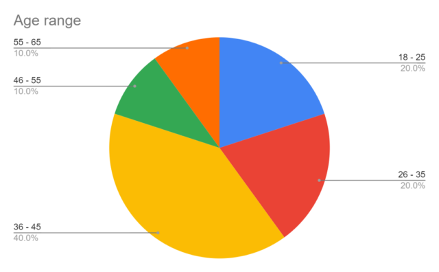
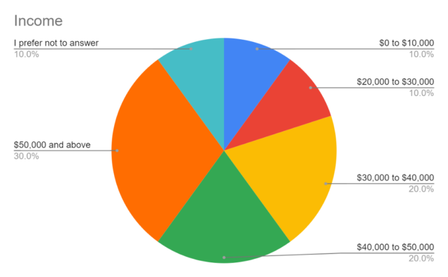
This meant that our careful targeting of a diverse group across those five demographics had varying success rates. We did land a good balance on age, occupation/subject matter familiarity (the range was 2–6 on a scale of 1–10), and income.
Race and gender ended up being more lopsided though. Our participants were 20% Multi-racial, 10% Hispanic, 10% African American, and 60% Caucasian. We feel this doesn’t accurately represent the demographics of who the justice system impacts the most.

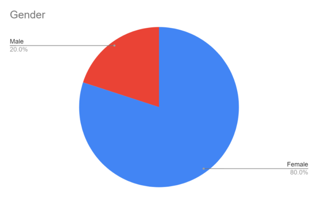
Gender ended up being 100% binary-identified users, 80% female and 20% male. Additionally, none of our survey respondents who identified as non-binary or transgender responded to session invites.
Testing begins in Part III…
Ultimately though, we did find highly insightful results that facilitated impactful reiteration. Because the scale of this redesign was so large, I went into the testing process expecting a laundry list of usability issues to arise. It’s just a natural part of the design process when making such global changes. What we found surprised us all. That’s all in Part III.